Thursday, 24 February 2011

Final Advert

Keeping to the colour theme, I've edited the artist in black and white with selected areas (her lips) in a bright colour. This is so that the digipak as a whole has a unique selling point. It's almost like the artist's trade mark for this album. The colour scheme is; Pink (relates to the CD album cover) and the green, yellow and black represent the Jamaican flag. The faded Jamaican flag edited in her glasses reinforces dancehall conventions of being proud of cultural background.

Her pose shows that she's a confident young woman who is proud of where she's from, hence the pointing and the sunglasses with the Jamaican flag edited in.

Haven looked at different dancehall/reggae and R&B adverts of different artist's album sell date, the date of the release is usually in a different colour of font which makes it stand out from the advert. However, I challenged this as I wante to make the artist herself the main focus of the advert, making her in black and white which an mid close up of her face and upper body.


Friday, 18 February 2011

Thursday, 17 February 2011

Audience feedback on our final product

Does our music video appeal to you?

Do you think our music video matches real dancehall genres?

Would you watch our music video more than once?

Our Music Video


After all of the research, planning and organising, finally here's our final product. It's taken longer than expected, but I think it's safe to say that our final product had turned out to be a success -223 views in 2 days!

Marketing Aims for the Whole Digipak

Product
Digipak

Target Consumer
Our product is mainly targeted at both boys and girls between the ages of 15-25 (mainly ethnically black due to the genre). I believe it would target mainly females as the song is about female independence. However this contradicts the idea of female dancers and what they're wearing etc in the video which is an advantage as it will also target the male audience.

Unique Selling Point
I believe that our unique selling point of our product is that it's in black and white. This allows the video to be 'stable' and show equality with all the cast especially in the video with different females and males. Although my initial idea was to have colour edits in order to make the video more watchable, having the video in just black and white shows a good consistency throughout.

Attention/awareness
I have created an advert to advertise my digipak to my consumer audience. As my target market is aimed at females ages 15-25, I will promote our product through posters (in schools/colleges/universities), add a promotion section on rave handouts/leaflets, social networking sites such as Facebook, Twitter and MySpace.

Interests
As mentioned above, my digipak will not contain explicit images/context which will then create a positive visual impact to the audience.  I'm looking to make my digipak stand out from the others through a black and white colour scheme with colour edits (selected areas of the artist, i.e. the lips in colour).

Desire
I would sell the product fairly cheap and affordable until popularity increases which then the price will increase. The theme of the song; Female independence, would have a positive respond to yound individual females as they can relate to the song (increasing popularity, therefore increasing promotion through word of mouth, then sales increase = better profit).

Action
In relation to the attention/awareness needed from above, we would promote our artist through popular gigs and raves under the influence of dancehall/reggae/bashment and hip hop. This will include flyers advertising the gigs/raves (featuring our artist as a guest performer) as this will increase popularity and awareness of our artist.

Price
The average price Cd's are sold for these are range from £7.99 - £12.99. The price mainly depends on the artist (on their popularity). By asking 50 males and 50 females 'How much would you buy this CD for?' Hopefully the result is positive and the price is above average (more profit). This method is called 'Penetration Pricing'. This is when the price starts off fairly low and one recognised in the market we could the increase the price.

Place/Locations
Where we sell our product is essential as it determines were our target audience is located. For example, it would be sold through music stores such as HMV which is a popular well known music store. Supermarkets would be useful as well as it broadens accessabilty of buying the product. Distrubuting our product through online stores such as Amazon and iTunes will also increase awareness/access to buy it.

Promotion
Buy using cross-media coverage, our product is promoted through different media and broadens our promotion. Promoting our product through television and internet adverts will again increase audience awareness.


Saturday, 5 February 2011

Looking at Magazine adverts


This advert is taken from from the famous reggea/dancehall magazine 'Reality Shock'. As we can see, all the images of the different artists are in black and white with a yellow, blue and black background. The writing is bold and big making it stand out from the page allowing the reader to read it straight away. I like the idea in keeping our artist's imagine in the advert in black and white as our audience would recognise it is her (as the video and CD cover are also in black and white).

At the bottom of the advert, we can see a bold black block that rungs across the bottom of the page with sponsers. I will think more about where and what brands would sponser my advert, for example iTunes etc. 

The bold black blocks in this advert is effective as it makes the text stand out - with information about competitions and the artists themselves it sets a well themed page.  


This advert isn't necessarily promoting an album but an interview of the well known Rihanna. This reason I've chosen to analyse this particular advert is that I like the composition and the perspective of the artist. Her looking back on her shoulder defines her facial feature (obviously through the use of lights and Photoshop) and I like that the information about what the interview is about on her shoulder. The coloura reflects her new look of a youthful, bubbly, fashionable expressive sense of style and music recent music videos (as they too are now full of colours etc).

I've noticed that her name is in capital letters and bigger compared to the rest of the text. This is because her name alone screams 'fame' and 'popularity' and almost gives a title to her image.


This is an advert is for the unsinged artist; Kyra Simone.  This advert is promoting her new album 'The Scent'. She posing laying down on what looks like a black sofa - blended in with the rest of the bottom half of the advert through the use of Photoshop. She's a wearing a blue dress which reveals her skin in a suttle way for example, areas such as her chest which is usually enhanced in music advert/CD covers which in this case it isn't. The light blue background go with the whole blue and black and white theme.  The patterns bring out a feminine element in the advert reinforcing that the advert is about a female. Also the her name has flowers/leaves again to reinforce  that this advert is for a female artist.

'The Scent' Out now' stands out in the advert as it's in a different colour and in a bigger which straight away draws the reader's attention. In my advert I will consider in making the font/colour of 'Out Now' stand out to let the audience know the date of when the album is released.  
The image of the subject (artist) and her name is the main visual point on this advert which instantly tells the audience who the advert is promoting. Also the name of the album/single is in big bold writing telling the audience that it is 'out now'. There's a website link underneath the album name which promotes the single and lets the audience know where to download this artist's song(s).


Ideas/try out of CD covers

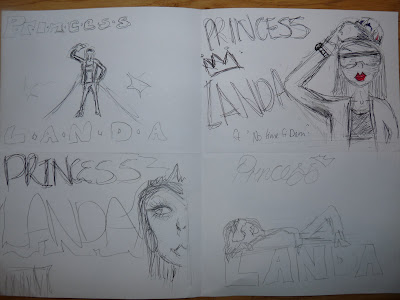
HERE'S FOUR ROUGH SKETCHES IF IDEAS FOR MY FINAL CD COVER

1) The first idea was having our artist in the middle of the cover and it would be taken from a mid-long shot revealing her figure and clothing. The idea was to show that she is a popular artist hence the flashing cameras and the red carpet look/effect. I wanted to almost juxtapose Hollywood's idea of glamour and fame (expensive clothes, makeup, cleavage etc) as appose to dancehall's look which is mainly tight fitted revealing clothes and exaggerated jewelry.

2) The second idea I had was to have our artist taken from a mid-close shot. This is because in the video she's mainly shot from a mid close shot with would then correlate well with the CD cover. The idea of her lifting a hat of her head was that the hat would represent a male of which she's taking off as she doesn't need a man to be successful or to pull her back. She would wear similar clothes to what she wore in the video so that she can then have a fashion mark which initially lead to bigger profits as she could go into promoting these objects/props which would lead to bigger profits and more awareness of her as an artist.

3) My third idea was that the artist's picture was a close shot only revealing half of her face. This is because she's upcoming and new - not a lot of people would know her. I believe it also adds mystery to her as a person as she is an underground/unsigned artist. She would wear a tiara simply to represent her name 'Princess Landa'.

4)My forth idea was that I'd edit my artist laying down on her name - to show her confidence and so that the audience could easily recognise the artist.


This is my first attempt in making my CD cover.

1)


Second attempt

2)


Third attempt

3)

As part of the marketing aims, I've asked for our audiences' opinion on which of these three of my attempts should be the final CD front cover for our artist's album.

AUDIENCE FEEDBACK:

Wednesday, 2 February 2011

More Editing

I've moved and rescheduled a lot of spare time in order to finish and perfect the music video. I've booked the editing suit and the necessary equipment (the hard drive and the camera/tapes in order to log and capture our footage). All lot of the time, our initial editor, Nawid, has put input into the video in terms of taking out personal time to help (much appreciated!). I find as the director my visual idea of the video comes to life with the use of editing hence as to why I'm editing a lot of the time.

Dates scheduled for editing:

Wednesday 5th January 2011 : Media Suit at 3:30pm - 8:00pm
Monday 10th January 2011: 3.00pm - 6:00pm
Wednesday 12th January 2011: 3.30pm-7:45pm
Tuesday 18th January 2011: 1:30pm-5:30pm
Wednesday 19th January 2011: 3:30pm-7:00pm
Wednesday 26th January 2011: 3:30pm - 7:30pm
Monday 31st January 2011: 2:00pm-6:00pm
Tuesday 1st February 2011: 2:00pm- 5:00pm
Wednesday 2nd February 2011:  11:00am - 2:00pm AND 3.30pm-7.30pm